CASE STUDY : Costa Coffee

Insight

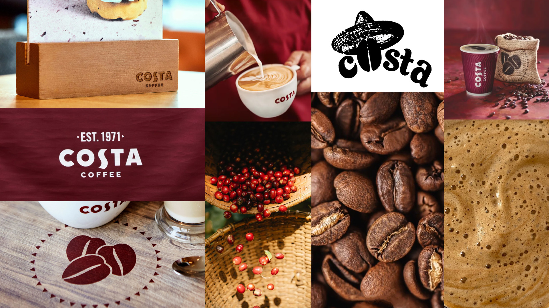
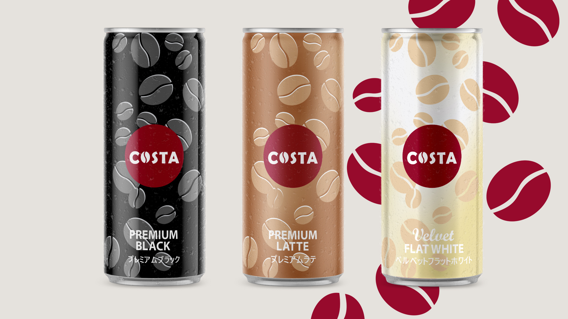
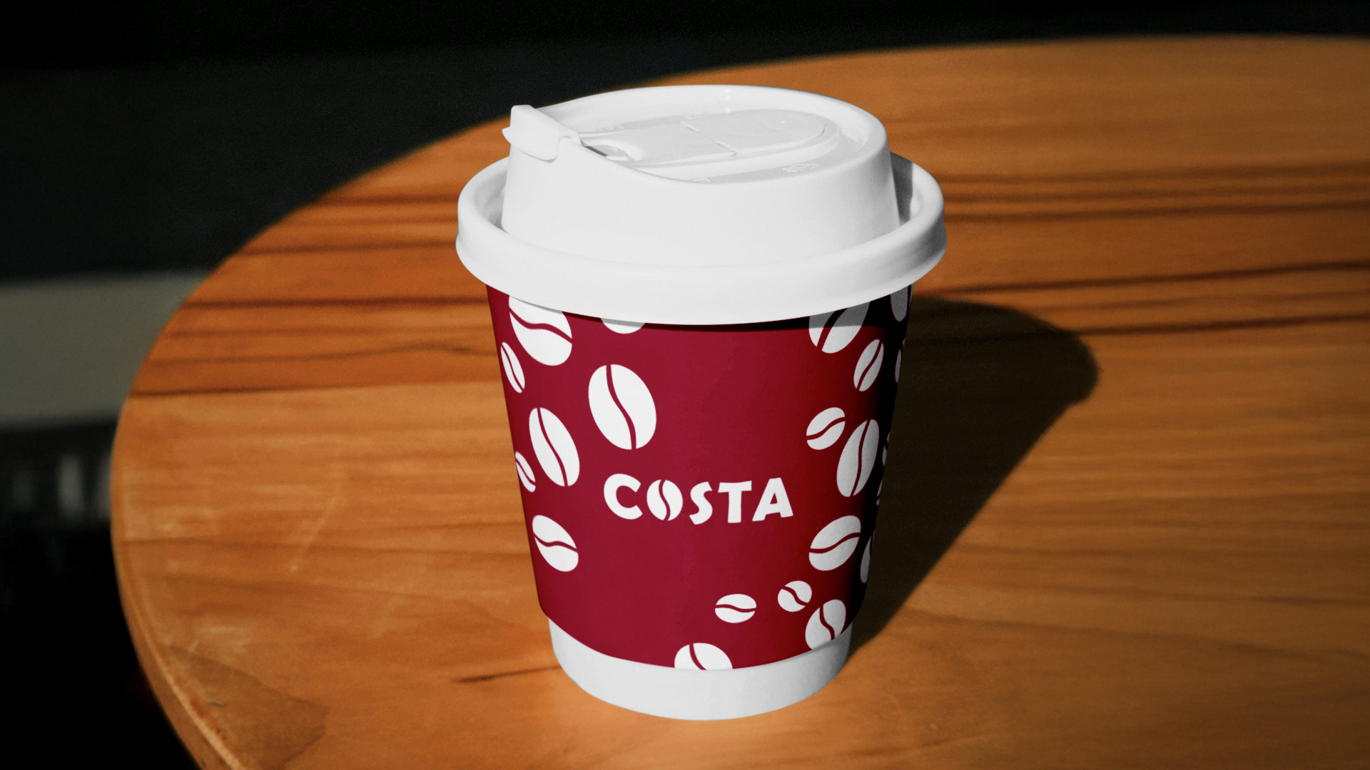
Costa launched in Japan in August 2023 with its first shop in Shibuya. However, more than a year later, the brand appears to be facing difficulties entering the Japanese coffee shop market and establishing itself among leading competitors such as Starbucks or Tully’s Coffee.

While Starbucks successfully embraced the Japanese market by adapting its marketing strategy through a diverse product range, exclusive merchandise, and seasonal limited-time offers, Costa has remained close to its European model and has yet to fully adapt to Japanese marketing practices.

Challenge

How can Costa Coffee be adapted to better align with Japanese consumer expectations and appeal to local audiences ?

As the coffee bean was a core element of Costa’s very first logo, re-integrating it in a more contemporary style would offer a meaningful reference to the brand’s origins.

As Costa promotes the “richness” of its products, emphasizing this quality through the brand’s logo typography would help create an even stronger visual identity.

The choice of adding a bright and deeper tone to the iconic Costa Burgundy Red Color would give a more lively, vibrand and eye caching look to the brand.

Berlin Sans FB Demi Bold serves as the base for its modern and geometric structure. Details like a stretched “S” and flowing wave forms introduce dynamism and continuity with the current logo. The adjusted font weight enhances richness while maintaining a refined look.

The redesign introduces a new, simple, and straightforward approach to Costa’s bottled coffee, using the brand’s core coffee bean pattern to refresh the visual identity and spark consumer curiosity.

Seasonal product designs help the brand align with Japanese marketing practices while adopting a more contemporary image to attract new consumers.

In this context, items such as bento bags, furoshiki, and water bottles are designed to accompany spring picnics during the cherry blossom season.

A paper-based coffee bag is proposed to align with the brand’s sustainable positioning, while adopting a simple, unified, and easily recognizable design.

Alongside the coffee bottles, a canned version of the products is proposed to expand the brand’s beverage offerings and reach a wider audience through Japan’s vending machine culture.

Costa’s Instagram account is given a refreshed look, featuring custom-made icons and a new art direction that prioritizes consistency through the creation of post series.

This rebranding proposal repositions Costa Coffee for the Japanese market by reconnecting with its origins while embracing local marketing codes. Through a refreshed visual identity, seasonal product designs, and culturally related merchandise, the brand gains a more vibrant, contemporary, and engaging presence.

By aligning with Japanese consumer expectations such as seasonality, sustainability, and vending culture, Costa strengthens its appeal to local audiences, expands its touchpoints, and builds a more distinctive and coherent brand experience in Japan.