CONCEPT : ATELIER du pain

Insight

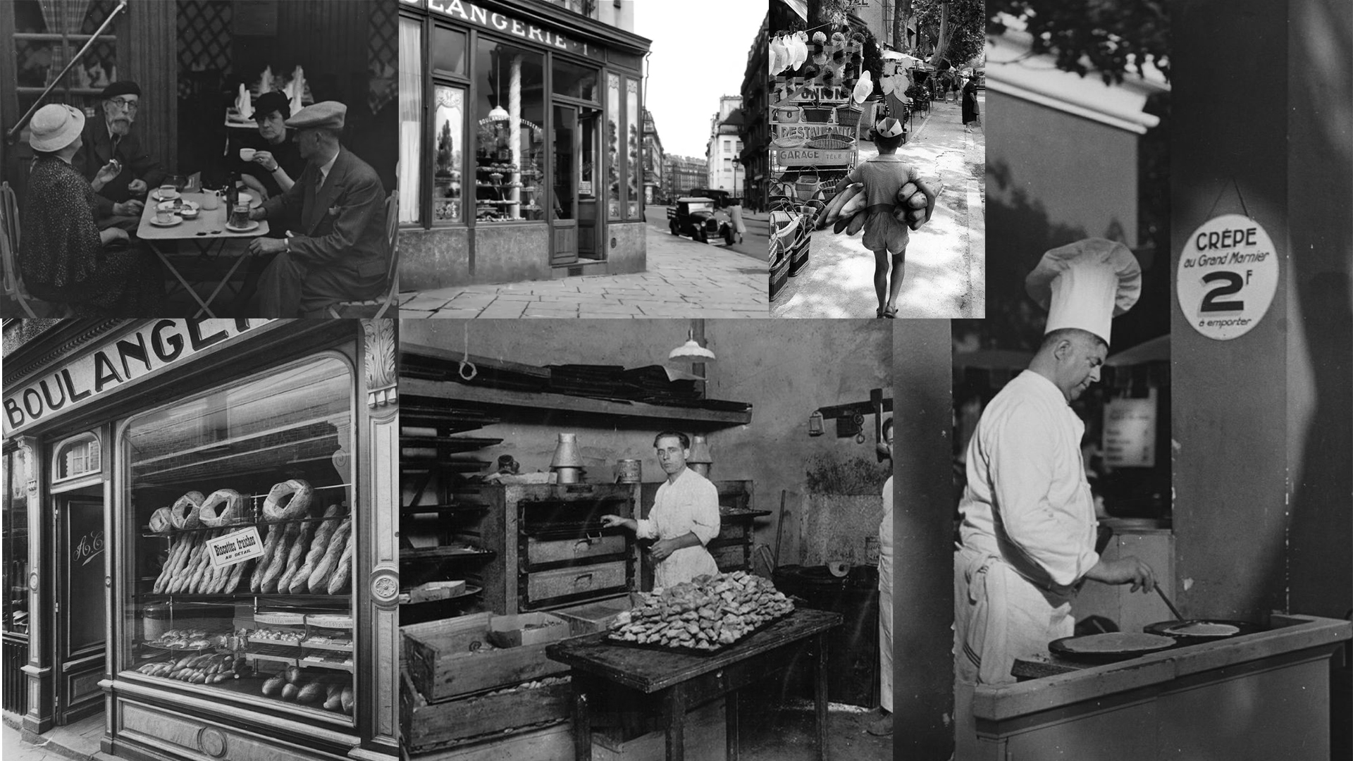
Over the past few decades, bread has become a staple of the Japanese diet, seamlessly integrating into daily life. While traditional Japanese breads, known for their soft textures and slightly sweet flavors, remain popular, European-style breads have been steadily gaining appreciation.

French culture, associated with elegance and authenticity, holds strong appeal in Japan, particularly in Tokyo, where it influences fashion, gastronomy, and design. In this context, French bakeries such as Paul and Aux Merveilleux de Fred have successfully established a lasting presence.

Challenge

How can a brand identity embody the meeting point between French artisanal tradition and Japanese minimalism ?

The logo draws inspiration from 20th-century French artisanal bakeries, incorporating the visual codes of period façades and serif typography to evoke a timeless sense of craftsmanship, elegance, and authenticity.

The choice of adding elements such as striped patterns, a baguette, and a moustache contributes to a strong and recognizable French visual identity.

Combined with the Prestige Elite Std typeface, the aim is to form a cohesive visual identity that reflects the brand’s artisanal roots, elegance and a unique personality.

By exploring different variations of the brand’s character, its identity is reinforced, making ATELIER du pain's visual identity and marketing more appealing to the Japanese audience.

With these brand variations, applications can reflect both playfulness and minimalism.

Building on the brand identity, the website reflects the brand’s core values while establishing a clear and compelling online presence.

A well-defined hierarchy and Z-pattern reading flow guide users through the content, enhancing both storytelling and overall usability.

The result presents a brand identity concept that blends French artisanal heritage with Japanese minimalism.

From the logo to the website, the concept was thought out with the specificities of the Japanese market in mind, integrating local aesthetic sensibilities and marketing expectations. Storytelling is developed through a visual character, while preserving the French influences that form the foundation of the bakery’s identity.